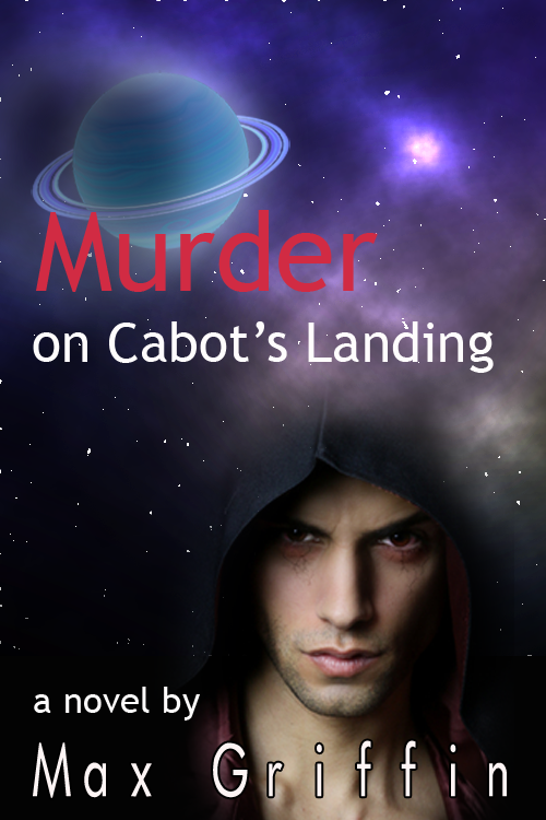
I’ve spent some time this week working on doodles for a cover to my current work-in-progress.
This novel started out as a locked-room mystery set in the 31st century, kind of Agatha Christy meets The Shining. It’s evolved from that to add a touch of Robert Ludlum and the Bourne series, not that I write as well as any of those authors. It’s also got a bit of Casablanca-style romance between the two main characters.
Eventually, I’ll finish writing this and my publisher will want ideas for a cover, so I figured, why not give it a shot? A professional artist will do better than my Photoshop doodles, but I can give them an idea of how I think a cover might look.
This has gone through several of iterations. Initially, I thought it might be something like this:

I didn’t like the fonts on this, and thought maybe adding rings to the planet might help. I also wanted a color picture of the guy, so I came up with this and shared it with some online friends.

People kind of liked it, but thought the planet looked cheesy. Also, almost everyone joined the “abs team,” i.e., the group who liked the picture of hooded guy with the great abs better than the handsome, but threatening guy.

That led to this version, which I think I like best. I’m not sure that the planet is better, but at least it’s shadowed in a way that’s more or less consistent with Mr. Abs. The planet casts a shadow on the rings, too, and its ambient glow is reduced on the shadowed side. I also made the sky a little more subdued than the prior version.
Anyway, I think I’ll stop doodling with covers and get back to writing. When I left them, my characters were under attack and fleeing through subterranean tunnels. I don’t think they’re going to like what happens next…

I like your first try the best.
First one gets my vote. (Not that my vote matters, but there it is.)
Wish I had your doodling talent!
But now I want to know about the subterranean tunnels and what is in them!